LIVESTRONG
Hope rides on.
CHALLENGE
In the early 2000s, Livestrong became one of the most well-known and well-funded cancer nonprofits in the world — built on the personal narrative and celebrity of its founder Lance Armstrong and more than $100 million invested by Nike. Following the controversy, Livestrong and Lance formally broke ties in 2012. In the years that followed, the organization shrunk in size and in cultural relevance. Yet it never stopped being relevant for people dealing with a cancer diagnosis. They wanted to reclaim their brand and all the positive feelings it once represented.
VALUE
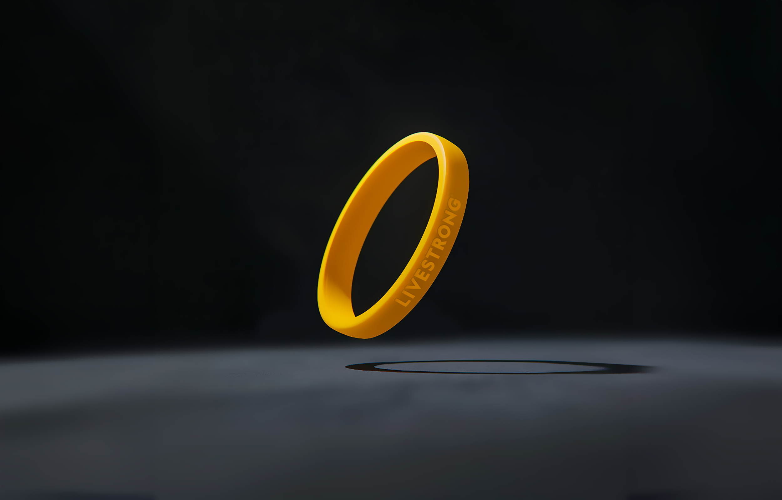
Like the people they serve, Livestrong is a survivor. After a challenging period in their history, they emerged stronger with renewed purpose and confidence. We helped them evolve their brand in a way that reconnects to their past but also signals a fresh new beginning. For their most loyal supporters, the people who never stopped wearing their yellow bands, the brand updates helped reinvigorate a sense of pride in Livestrong’s mission. We also expanded and modernized their visual toolkit, giving their team the flexibility to express the brand across a wide range of communications — from the front of a cycling kit to the front cover of a 200-page report on survivorship.
SERVICES
Strategy & Positioning
Visual Identity
Social
The evolution of the Livestrong logo from 1997 to present
LOGO
Before it became the name of the organization, Livestrong was originally just a program name within the Lance Armstrong Foundation. And over the years, there have been many iterations of their logo.
For this next chapter, we modernized the iconic yellow band logo by reducing the space between the letters and selecting a more dynamic typeface. The new logo directly references their past, but the taller and bolder face helps improve legibility and sets their brand up for the future.

DESIGN SYSTEM
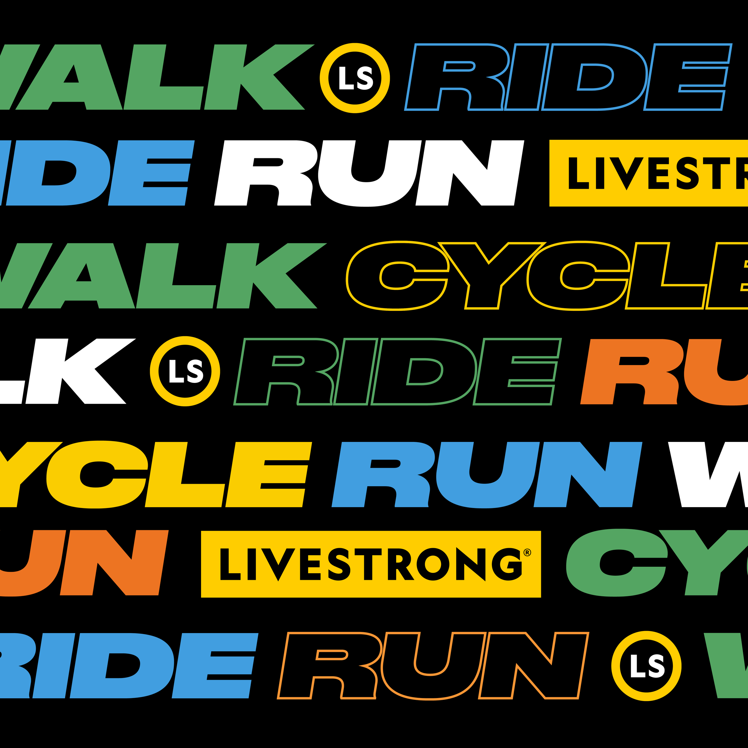
Livestrong’s brand has always had a strong connection to athletics. Events like marathons and fitness partnerships like Livestrong at The YMCA offer survivors and people undergoing treatment strength, hope and a sense of community. The organization also has, more recently, flexed their analytical side, publishing research reports and establishing best practices for cancer care through The Livestrong Institutes — a partnership with the Dell Medical School at The University of Texas at Austin.
Since sometimes their brand needs to feel more sporty and other times more scientific, we added new typography, colors and iconography. The expanded toolkit gives them the flexibility to adapt to a wide range of different communication needs, yet everything still feels like it's all part of one brand.


“Lorem ipsum dolor sit amet, consectetur adipiscing elit, sed do eiusmod tempor incididunt ut labore et dolore magna aliqua. Ut enim ad minim veniam.”
SUZANNE STONE, President and CEO at Livestrong