WE ARE BLOOD
Bonding with the locals.

CHALLENGE
The Blood Center of Central Texas was at a crossroads. They were facing growing competition from national blood donation organizations who often take blood out of the community and new pricing pressure from large hospital systems. They needed to reinvent themselves. They needed a new name and brand that could help people understand the value of giving blood locally and position the local blood supply as a vitally important shared community resource.
VALUE
The new brand identity finally gave them a way to express why they’re different. This gave their staff a clear purpose and a filter for how their brand should show up. And it gave donors a compelling reason to give, helping them to thrive in a market with increasing competition.
SERVICES
Blitz
Strategy & Positioning
Naming
Visual Identity
Tagline
Fleet Graphics
THE NAME
Most blood donation organizations have very straightforward, descriptive names. We saw a huge opportunity to differentiate the brand with a name that was less conventional and more evocative. We Are Blood is not just a name, it’s a phrase. And it offered a way to describe what they do and also what they believe—that we’re all connected through the local blood supply.
VISUAL IDENTITY
The organization had been around since 1951. And even though the name was changing, their mission wasn’t. So it didn’t make sense to completely leave all that history behind. The brand was setting a bold new course for their future, but it still needed to honor their past. To do that, we took inspiration from mid-century graphic design to create a new visual identity that also felt like it had been around awhile.
The icon in the middle is a tree inspired by the shape of capillaries and a way to further reinforce the idea of family and connection.


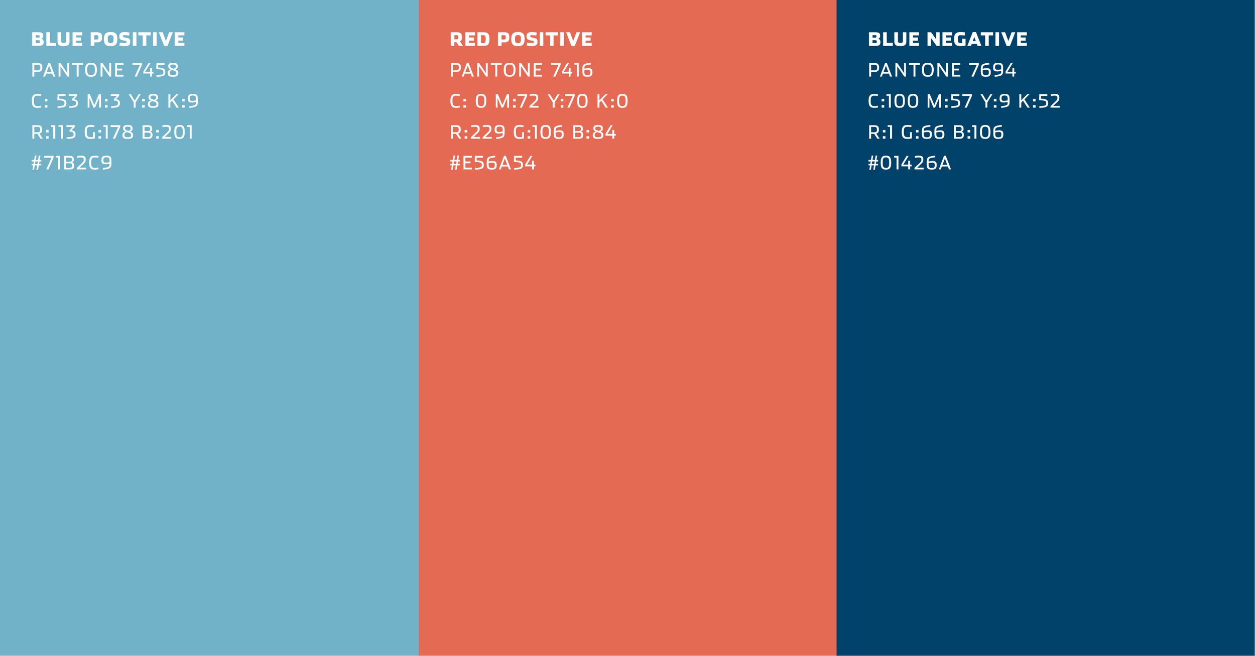
COLORS
After reviewing the competitive landscape, we also noticed another big trend. Red. It’s everywhere. And not just any red, but a deep anxiety-inducing blood red. Choosing a reddish-orange color was another way to further differentiate the brand.
The reddish-orange and cool blue color pairing also represents blood flow to and from the heart.

TAGLINE
The tagline helped complement the name, using “drawn” to reinforce both the act of giving and the organization’s connection to the community. Adding “since 1951” offered another opportunity to connect to the organization’s past.

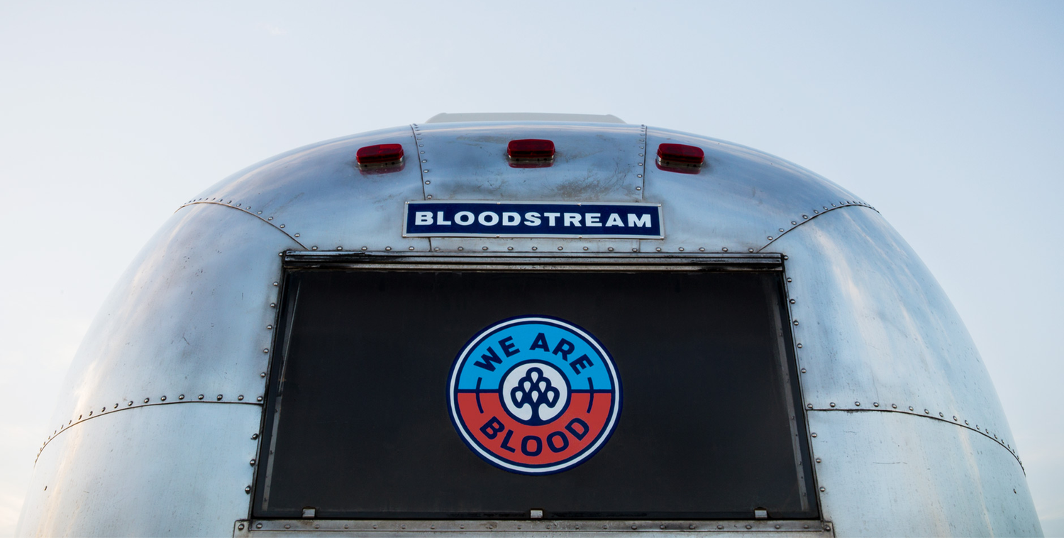
THE BLOODSTREAM | The brand couldn’t just say it cares about the local community. To be believed, it also needed to show it. So as part of the launch, we helped them create a custom-built Airstream trailer specifically designed for community outreach at local events. This activated the brand and offered We Are Blood a way to connect with locals in a more informal way, outside of the medical environment of a blood drive.


FLEET GRAPHICS
We Are Blood didn’t have a large advertising budget to promote their new brand. But they did have a large fleet of vehicles that go out into the community every single day. We leveraged the identity’s dual color scheme to create an army of roaming billboards for the brand.


EXPRESSIONS
Let’s face it, the very idea of giving blood skeeves a lot of people out. And we couldn’t change the fact that it’s still a sterile medical procedure. But the brand could play a role in helping people feel a bit more comfortable.
So we created additional expressions with messaging and design elements that evoked the organization’s friendly and inviting tone.
“It’s tough to rename a 65-year-old organization. And it’s even tougher to find a name that pleases everyone. But I tell you what, we sure are happy with where we landed.”
MARSHALL COTHRON, CEO of We Are Blood

PEOPLE

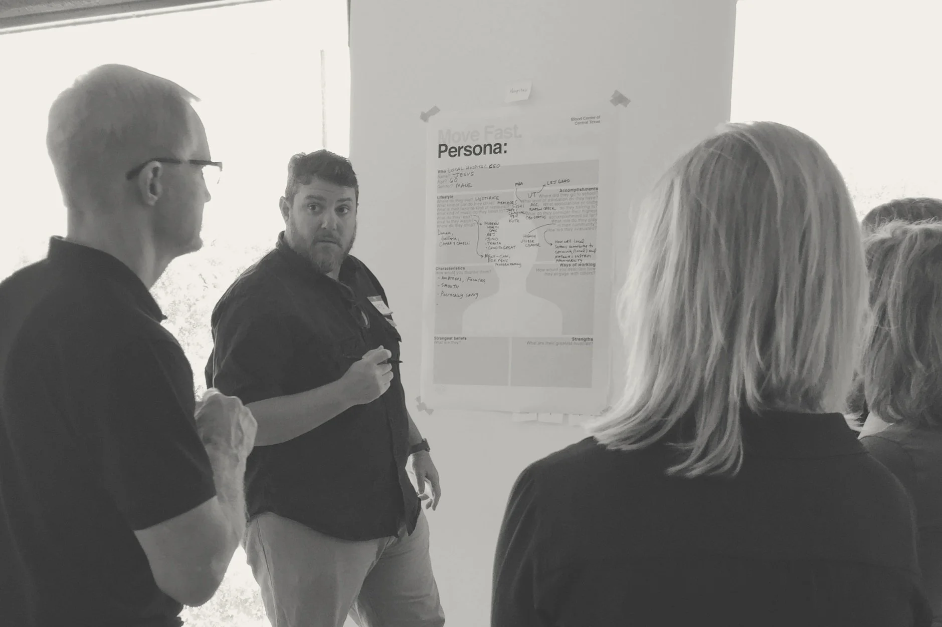
GETTING TO THE HEART OF THE MATTER | We worked closely with CEO Marshall Cothron and their executive leadership team to define a new vision. And to gain insights and inspiration, we blitzed with 30 people from their team—which included everyone from board members to phlebotomists.